Showing posts with label decorating on a budget. Show all posts

Sunday, April 10, 2011

Mixin' It Up

Sometimes, inspiration is just a few pushes of furniture around the corner.

I was getting kinda tired of the furntiure arrangement in my living room. I have tried it every which way, it is a very long and nwrrow space that connects to the dining room. There's always a big empty space between the LR and DR that the kids use a space to wrestle n stuff. I thought I might take advantage of that space a bit.

Things against me are, of course, the shape and size of the room. Then there's the shape of my coffee table-- a perfect square--which is so totally the wrong shape. An elongated oval would probably be perfect. But I am NOT buying any new furniture in the near future, so it has to work. Plus I really like it. The other boo-boo I have to work with is my big long green couch and matching HUGE chair. Did I mention this chair is HUGE? When I saw it in the showroom, it looked so elegant and it gave off airs that it wasn't as big as it really is. Here in my normal-sized home, it is very hard to place. So previously, I have shoved it into a corner. But that kept my furniture against the wall, which, is supposedly a big no-no. Then, my "Ann's Folly" pair of CL chairs. You can read all about them here and here. Basically, the style is all wrong in this room- but I really like them and I am forcing them in. So there. Then the biggie: The Fireplace. Most people who visit my home for the first time leave never even knowing I HAVE a fireplace. Its 60's modernity and low firehole make it almost invisible. And the awkward placement makes it hard to arrange furniture aorund it n a traditional way.
Well, without further ado, here's my "re-do":

 It's kinda tight, one of my rules is I don't like tight spaces, but it works. For now, anyway! I know I will probably get bored and change it. Now that I see it in a picture, I can pick it apart. The fireplace really needs to be painted, or something, like I thought about here. That is, IF I want to keep it as a focal point. Maybe I don't. This space, since it sits in the middle of the room without wall anchors, needs an area rug to define it as it's own space. Not to mention pull all my colors together(Lime, plum, white, brown, black, mustard, turquiose--heck I keep adding more!) I already have wall 2 wall carpet in there, so laying down an area rug is tricky. People trip over them all the time. But it would look nice. My little primer-gray end table really needs to be finished. Now I am thinking Black, like the round one there by Mr. Big Chair.

Holy batcave, Batman, I like the way this is laid out.


pretty much what you see as you walk into my LR from the  foyer
It's prety difficult to mix styles like I am trying to do here. Where's Sarah Richardson when you need her? She makes it so effortless.
One of my fave SR rooms...look she has a cane chair AND a modern couch!


Later this week we'll take a look at, and pick apart, my Master and Master bath. Oooo, fun!
Make it a Great Day!
Ann

Monday, March 14, 2011

Zero Dollar Projects for a Zero Dollar Budget

Last week I finally got my tax prep stuff ready to take to the accountant. All I could think when the total was added was: Where did the money we made go? I mean, bills, yes, but the rest of it? Sweating, I added up a typical month of "misc" expenses: Walgreens, Target, BigLots, Homegoods, Kohls. Not pretty. Not pretty at all.  Let's just say, a European vacation could have been had if that money went into savings. Or a jacuzzi. Or a bazillion much worthy home projects that would make a HUGE difference: Can you say New Windows??An Exterior Paint job? Arrrgh....that would have had tons more impact than new pillows or candlesticks. But I can mend my ways.....


Our circa 1969 windows that shake and rattle
 So this year, in an effort to straighten up and fly right, I am giving up frivolous shopping for lent.

In that spirit, all this month I will be looking around for projects I can complete for ZERO DOLLARS. I have many supplies in the garage, and lots of unfinished "to-do's" around here. It will force me to be creative and work with what I already have.


Tower O' Craft products
 Have you any projects you can think of that you can complete with stuff you already have?

Here's a few Zero Dollar Projects on my list:
Decoupage a side table for daughter 2's room. I already have the Japanese packaging labels and newspaper to get started, and a whole new jar of Modge Podge.

Paint remaining Orange Oak cabinets....


desparately needs a makeover!!!


I am thinking walnut brown...


The grayish-taupe sample color is already splonged on there--has been there awhile!


Ah, this is my vanity. I WAS going to just remove it...but I can paint it in the meantime. Maybe I will like it better and it would stay.
 Paint the fireplace already!

Finish my tiered table (its not even sealed...the gray is just primer...but I like it so it stayed as is)

Plant seeds!

Chalkboard paint Something!Already (I have had this paint forever)


Paint O' Rama
 Spray paint something Apple Green...I have the paint, just need to find the right project.

What can you do for Zero Dollars?
Make it a Great Day!
Ann

Wednesday, February 23, 2011

Bulletin Boards

I was reading through this past week's SNS special feature on bulletin boards. An easy, cheap, very useful project and yes I have made a few! Here they mine..........

Here's one I fashioned from an old gold frame, which I spray painted in "Grape" and some leftover black and white outdoor fabric and ribbon.
Here's a $3.00 Homegoods clearance find...just added new ribbon to update it and some cute buttons...

This was a large plain cork board with a pretty frame I found at GW--added my fabric and viola!


Friday, February 18, 2011

Den Transformation

It started like this when we first moved in

I mean, can it be any more boring? Good points: its a big, neutral space, and the kitchen is adjacent as one great open space.

We needed a sofa desperately, and found this one.

In choosing this sectional, I thought I was solving two major problems: need for seating, and filling up the space. I realized after it was there a few months that I should have ordered the reverse...so that the chaise was on the other side to bridge between the kitchen space and the den.... Oh well, I was going to HAVE to make it work!


This is the other side of the room...so heavy with furniture while the other side is so empty


I posted about my color dilemma--those white walls were just too boring!
 So a few months, painting and furniture rearranging later...
ta da!

BREAKING UP THOSE 2 HUGE BOOKCASES MADE THE ROOM MORE BALANCED

Getting the furniture away from the walls also made the room feel less long and narrow.
A reading nook emerged

Plenty of room to stretch out. And cozier to boot. Now everyone can see the TV.
The color is Ben Moore Pale Smoke, cut by half with white

I think we're on to something here. I still have to put  up the curtains...they are so pretty I can't wait.  The kitchen was painted the same color. I love it with my espresso cabinets. ( I will post on that another day--today my kitchen is sorta messy!)
Again, Before:
AFTER:

The best part? It cost me just the gallon of paint. Yes, it's a large space but more than half of it is windows, so a gallon did it all. Accessories were stolen from other rooms.

Let me know what you think!
Thank you Chic on a Shoestring for featuring me!
Make it a Great Day!
Ann

Thursday, February 17, 2011

Basket Case

Longaberger headquarters in Newark, Ohio
Yup.. I am a total basket case when it comes to baskets. I have many, in every room in the house, for may tasks. I am always on the look out for abandoned Longaberger Baskets at yard sales and thrift stores, but so far no luck. Someday.

I do have great luck finding all kinds of baskets for a song. I usually do not spend more than 50 cents on any basket I buy.

Here's an assortment of my baskets--they are hard workers-throughout the house!

Favorite kind of hamper--light, ventilated, and cheap to replace

kitchen...hold paper towel rolls perfectly and what-not

perfect size for those square napkins I buy by the boatload from Sams

in the bathroom

great for corralling those extra blankets and pillows...

should probably find a better fit for this one.

purse-catcher

GREAT for kid-clutter

weapons storage

Right by the front door

paper at the ready....

Now if we could just put the stuff INTO the basket...

I love these loosely woven baskets--and the perfect size for dvds

Can't have too many magazines...
Make it a Great Day!
Ann

Monday, February 7, 2011

Is Your Home Too Uptight to Be Fun ?

Comfort or Intimidation? source: Gunkleman
Magazine photos often make me swoon.... but are they conducive to having fun? Do they scare away guests or invite them in?

I had to ask myself this question this weekend as I was cleaning up for a party-get together with friends. My kitchen is the place in my home where everyone congregates. Its big, but not huge. I was trying to find a way to make my living room a destination too. Its so much larger and can accommodate many more people, more comfortably or so I thought. I have to actually announce: Let's all move into the Living Room, and even then, people hesitate. Why? I realized there were several reasons I could see.  It was too barren- bare--booorrrring--not enough to pull people in there. My main reason to go in there is to escape, have silence and read---doesn't sound fun or exactly invigorating, right? I mean, my chair and couch are comfortable to sit upon, but maybe not as approachable as I would like? Plus it is far from the kitchen. I had to ask myself: Why is it guests would rather squeeze in the kitchen? Because its warm, casual, messy with wine glasses and plates, people in and out of the fridge: its comfortable and definitely not uptight. I  want rooms that are approachable not intimidating. Is my fear of clutter undermining my creation of a warm, livable home?

So my task will be: create more comfort and casual- ness without sacrificing style. Here are some inspiration pics from my files:

Here, from Joni Webb, Cote de Texas, a warm, stylish, chic room that is not uptight in the least, right?
I LOVE this, but not as warm or inviting. source: Gunkleman

Same here, a little scary for a guest with red wine perhaps?  


And then, ahhhh-- this seems so inviting to me!

 So what here are the common "comfort cues"?

1. Comfort
No need to embellish is there?
I mean, if its not physically comfortable, no one will willingly go in there. But comfort is more than that. Its feeling safe. Not afraid to make a crumb or put your feet up.
source: Cote de Texas  


Definitely more formal, but something about the vibrancy of the patterns makes this feel welcoming source: SarahRichardson
I love this one: a hotel lobby no less, but the warm colors and pattern play makes me want to hang out in there.
my Living Room

2. Access
This is a challenge in my own house, where rooms are large but awkwardly shaped. Long and narrow rooms are difficult because you want several areas of access and "escape" ie. no one wants to feel trapped: like once they sit on the couch they have to climb over several pairs of legs to get out of there.

This looks a little tight to me, although there is access on either side of the couch, I wouldn't want to be in the middle of it.
Here the smaller tables allow much more leg room. Source: HGTV


Here too, more seating and furniture, but plenty of room to get up and move around freely. (albeit a much larger space)Source: Diary of a Renovation


Dining rooms seems to be especially challenged here. My own Dining Room is very difficult. I really think I need to ditch my China Cabinet so there is enough room around the table and chairs to be comfortable. Right now, its pretty tight. Having NO china cabinet would greatly increase the comfort level in there I think.
Here, plenty of room for those big end chairs to be pulled out. No cabinet to suck up space.
Here's mine. You can see the China Cabinet is pretty darn close to those chairs.


Even though this is tight next to the hutch, because of the round table it works.
3. Relaxed not Uptight
You really don't want guests to be nervous they might stain something or break some treasured object.

Obviously, not "for reals"

Here, a collection done for real life. Not scary.

 White doesn't have to be uptight... I'd love to sit a spell in this room:
from younghouselove

 But, not so much in this white room:
source:freshome

 4. Functionality/Purpose
 I realized: If a space has no apparent function, the objects in it are all "just for show" people will not want to go in there. Trust me.


I had an aunt who had an entire floor of her home devoted to "untouchables"...everything, and I mean everything was covered in clear vinyl. And her claim to fame was: "I've never ever used my wedding china". It just sat in a china cabinet "for show" I hate that. Its sad. It was scary as a kid the few times we went up there--like a museum tour. I was afraid to sneeze.

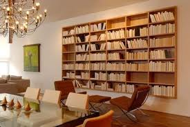
I recently saw some "decor ideas" in a decor mag. One of the ideas was : Books as Decor. Now, I am all over that. Love books. But I actually enjoy READING them. Here's what I mean:
Books are displayed "backwards"...spine facing wall. Huh?

Here it is again. I think its nuts.


not sure if this is really for real.
 Or, the pile of books. I like it, if you were actually reading the pile. Or reaching for a book wouldn't topple the whole thing over. Or spill a vase in the process.
This makes me nervous
This makes me want to sit down and pick up a book!
 
Make it a Great Day!
Ann